FOUR POINTS RE-DESIGN
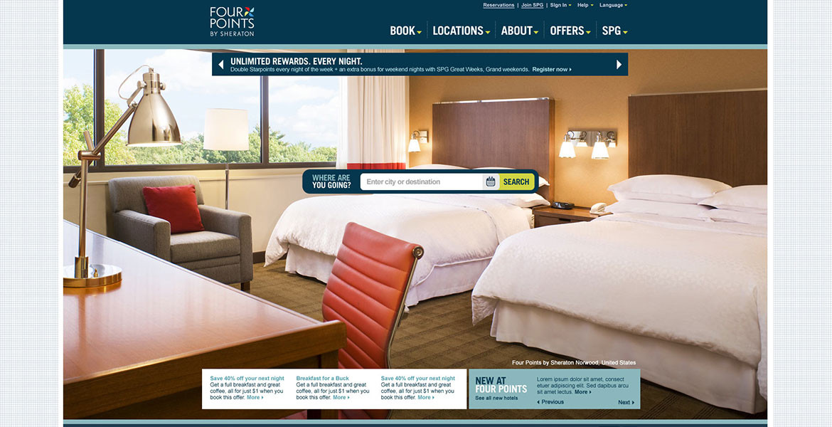
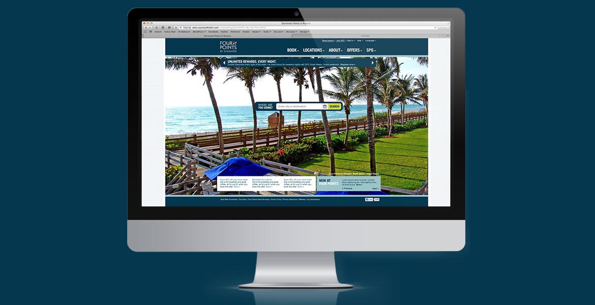
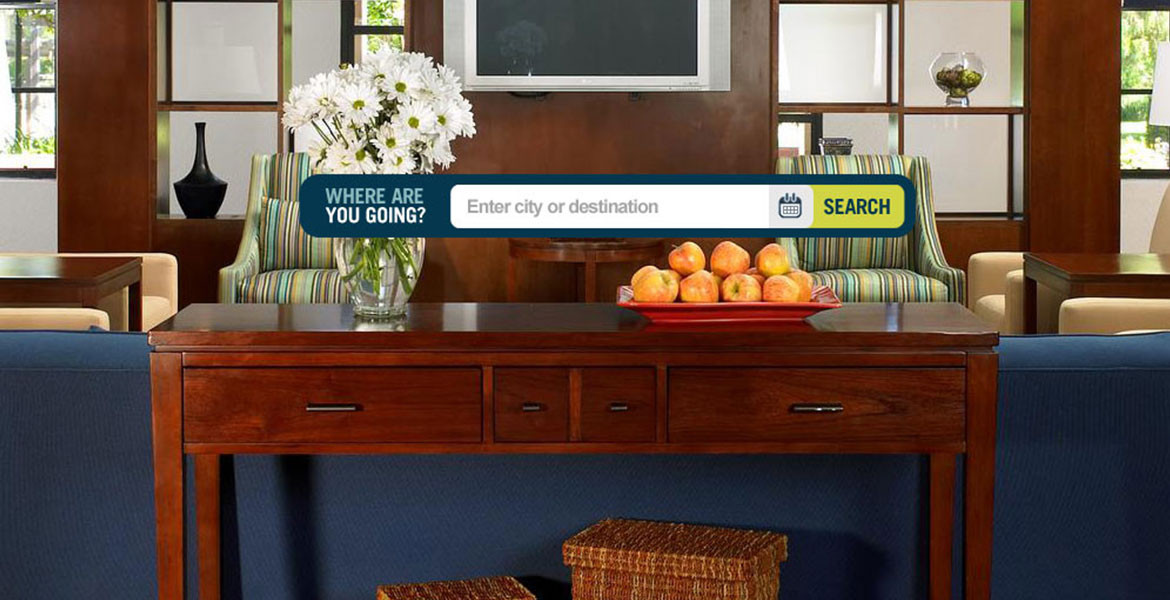
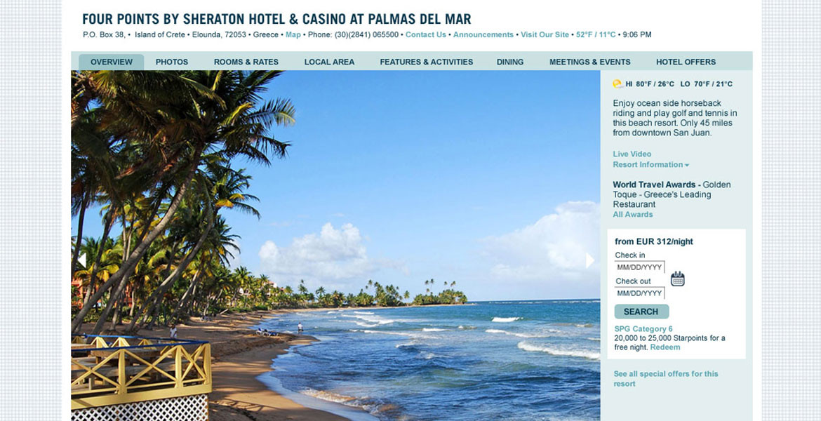
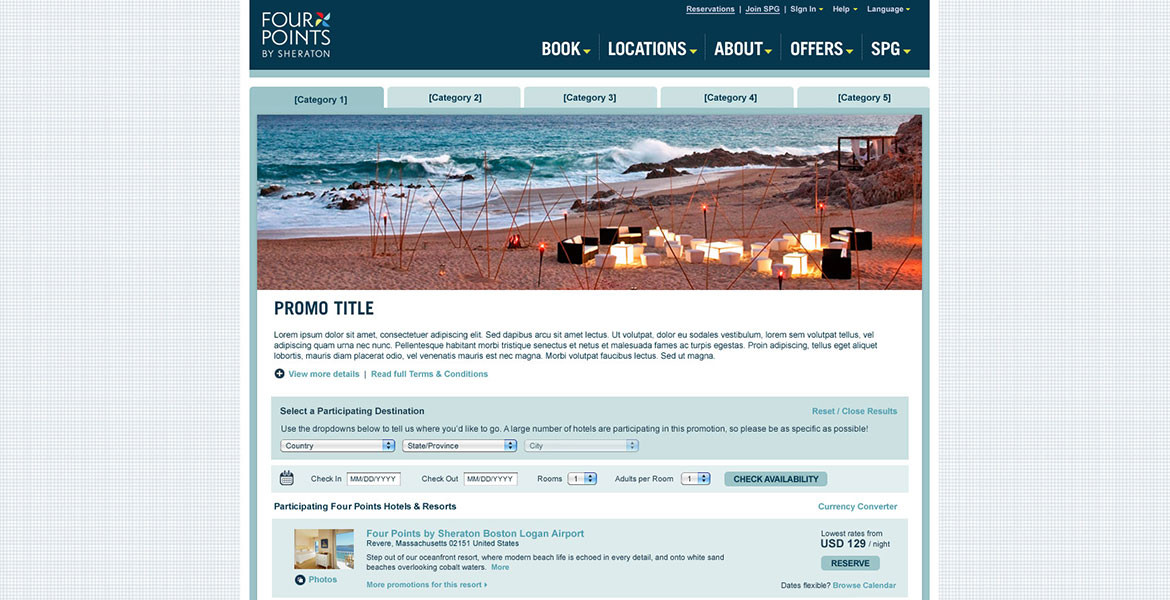
One of the key elements of the Four Points branding is simplicity. Style merged with service. Comfort merged with all the extras you would expect from a great hotel for a great rate. We tasked ourselves to create a website that embodies those qualities. A very simple, one line search box lets a guest immediately reserve or explore hotels. And a home page featuring a large, full-bleed image carousel depicts all the extras and comfort you should look forward to during your stay.
CLIENT / Four Points Hotels
ROLE / Art Direction, Design, UX Design
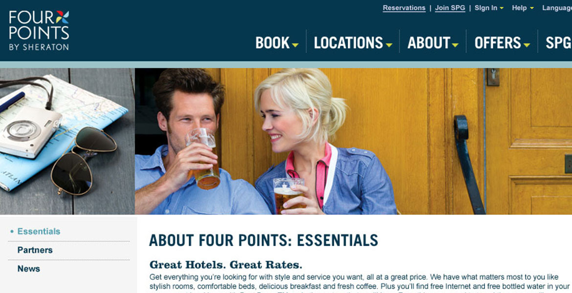
Simplicity of design is carried through into the main navigation where only the essential words to prompt a guest’s exploration are used. Clean, white interior pages with a bright grid pattern adorn the side. Even the color scheme is pared down to primary shades.

