LUXURY COLLECTION RE-DESIGN
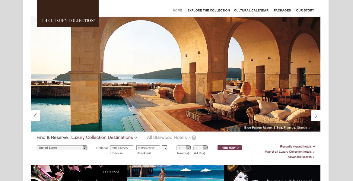
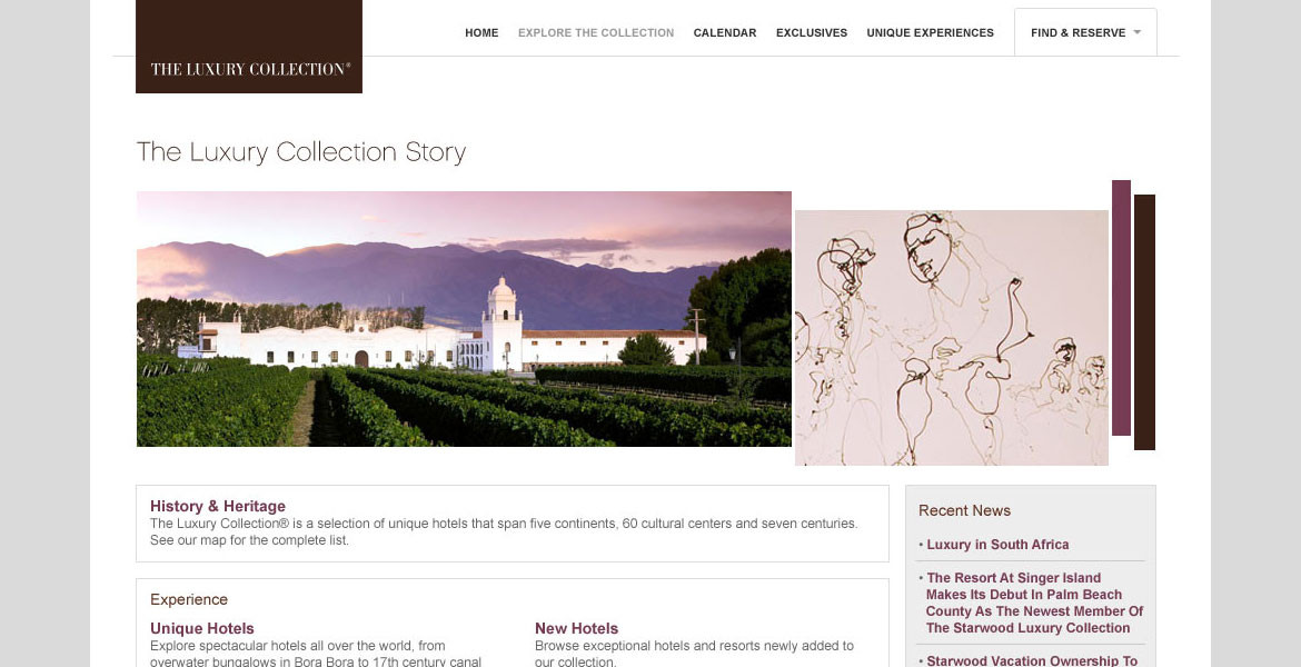
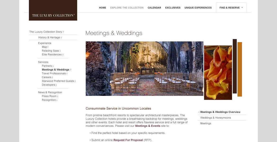
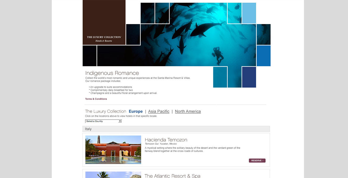
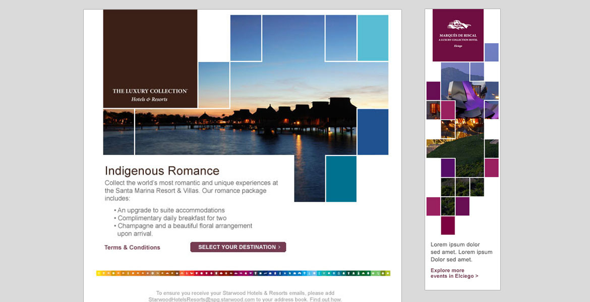
The redesign of The Luxury Collection’s website and marketing was the first step in re-creating the brand’s global visual language. The challenge was designing a site that would bring together and make sense out of 69 different hotel brands and bring them together all under The Luxury Collection brand in a cohesive, elegant and modern method.
CLIENT / The Luxury Collection Hotels
ROLE / Art Direction, Design, UX Design
Webby Awards Honoree – Travel category
Adobe – Site of the Day
WebAwards – Standard of Excellence
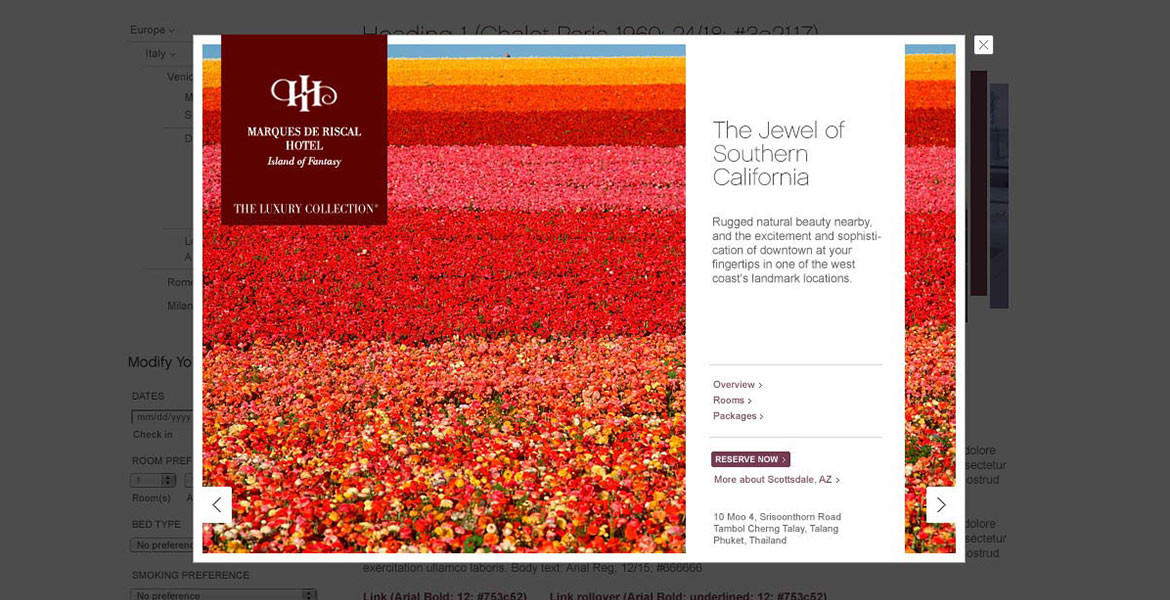
The strategy for the site was to create an experience that mimic a museum in that it would be a clean gallery space were the diverse hotels and resorts could be shown. Each property had its own shade of color that emulated its locale and independent branding. We valued the white space between these pieces of art knowing that it would give each hotel and resort space to stand on its own while still pulling it all together.
Starwood re-launched the Luxury Collection’s website giving the brand a new look and feel – replacing the old-fashioned look with a modern, sophisticated feel that still exudes luxury. In fact while viewing the site, we felt we should be wearing a suit and tie, smoking a pipe and petting a small dog.
HotelChatter.com Review

