SPG RE-DESIGN
The re-design of SPG.com launched the new global visual brand language and new tools, features that were unprecedented in the hospitality industry. The goal of the re-design was to provide members with personalized access to the program and a rich, customized online experience.
CLIENT / Starwood Preferred Guest
ROLE / Creative Direction, Design, UX Design
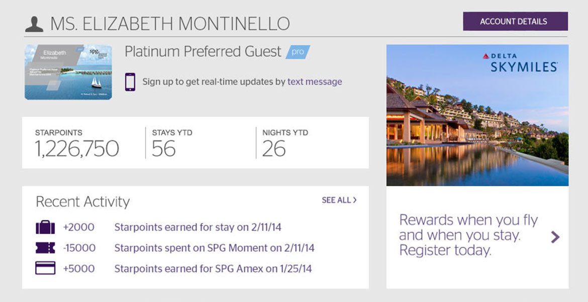
One key reason for this redesign was to highlight users’ SPG account information and show them what is possible with their SPG points. The account section transitions into an SPG Life section which highlights the SPG social media channels and multiple ways for members to use their points like offer and SPG Moments auctions.
We also looked at how SPG guests interact with all of the member benefits offered to them. Prior to the re-design, the pages that spoke of the program lacked any beauty or full explanation. Designed charts that clearly show the various SPG levels now grace those pages as do indepth sections that describe Starwood’s brands, earning and redeeming Starpoints, SPG Pro and the SPG Life.
We also looked at how SPG guests interact with all of the member benefits offered to them. Prior to the re-design, the pages that spoke of the program lacked any beauty or full explanation. Designed charts that clearly show the various SPG levels now grace those pages as do indepth sections that describe Starwood’s brands, earning and redeeming Starpoints, SPG Pro and the SPG Life.
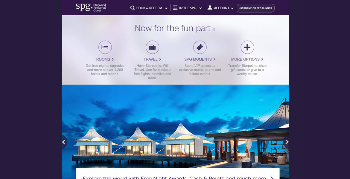
The re-design also included a complete rethinking of the redemption section of the site executed with the help of Code & Theory. The new version of the redemption area on SPG.com clearly laid out all the redemption options in a visual manner meant to inspire SPG members.


