ST. REGIS RE-DESIGN
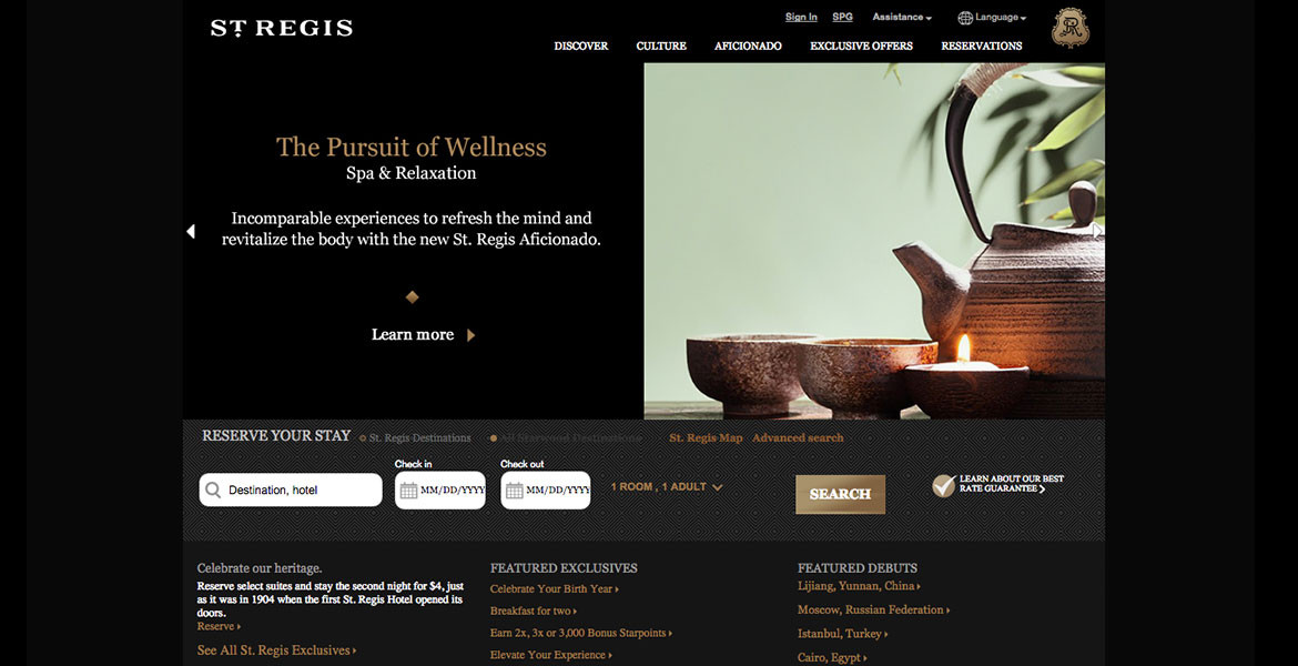
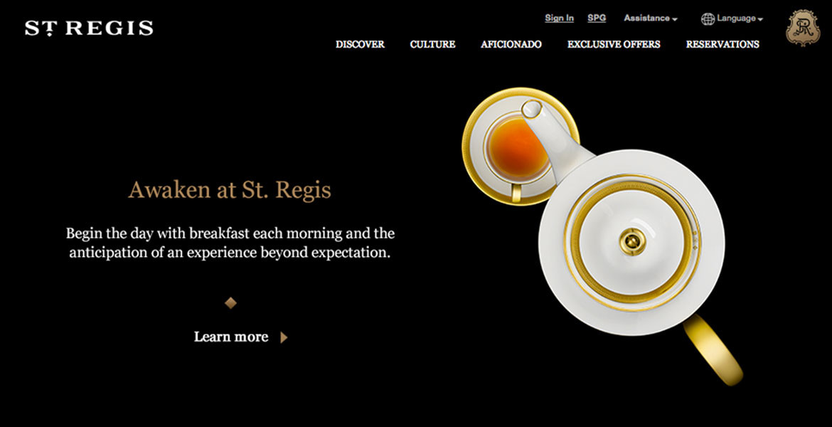
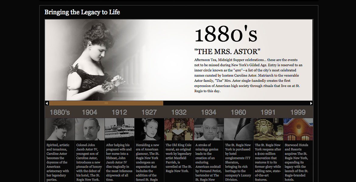
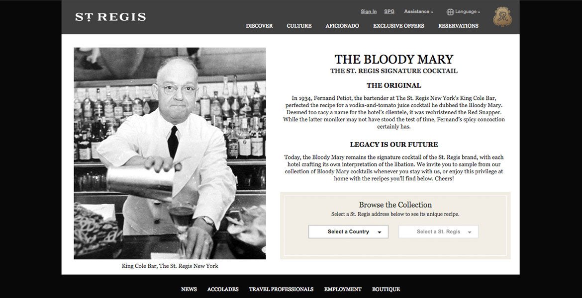
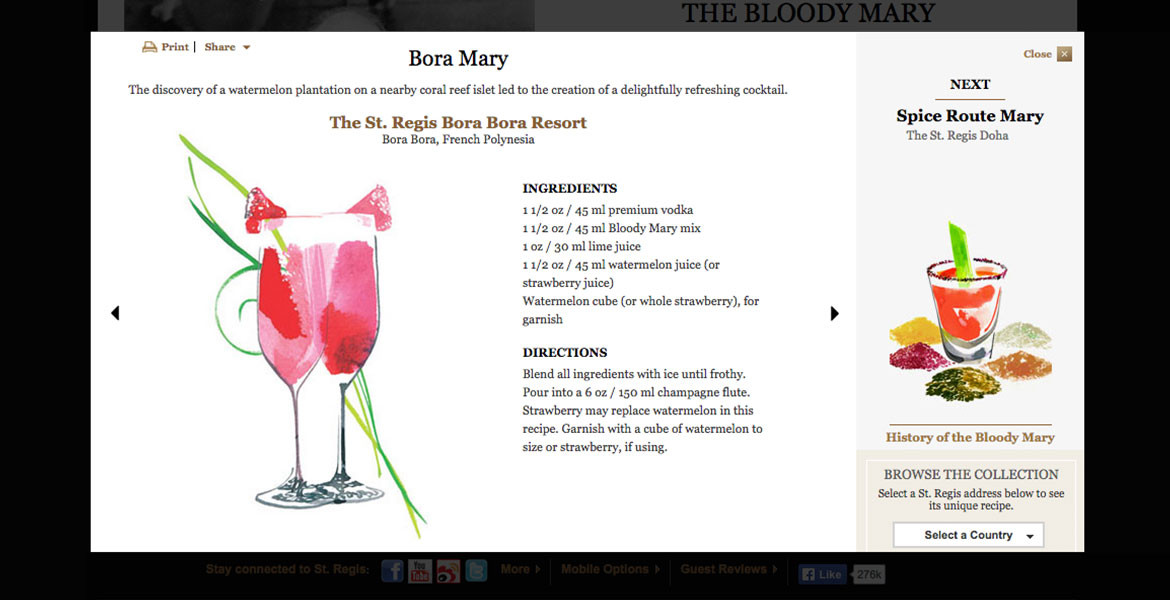
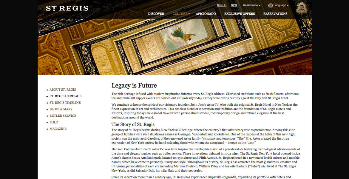
Founded by the Astors, St. Regis has a rich history that began in New York City. Taking that legacy and history and breathing new life into the brand while paying homage to its history was the challenge of the St. Regis re-design. While the St. Regis logo was modernized and the crest simplified, it maintained its legacy and luxury. The new brand photography was graphic and bold, and the typography elegant. We took these elements and the rich pattern that cover the collateral and created a textured site that was relevant and modern and full of history.
CLIENT / St. Regis Hotels
ROLE / Art Direction, Design, UX Design
WebAwards – Standard of Excellence
The design and concepting began with an in-depth tour of the St. Regis New York. We spoke to butlers, the concierge and ultimately guests during our creation of the site. We knew we needed a simple but texturally and visually rich site that could be easily navigated and explored. The site needed to embody the story of the brand through its programming and cultural pages. And it needed to remain simple and elegant as well.

